Layout
Our layout guidelines help you to create consistent experiences across different platforms, environments and screen sizes.
Layout principles
Responsive
Our layout principles adapt to different screen sizes, so that users get a great experience regardless of what device they’re using.Flexible
All of our defaults can be modified to meet the needs of different users.Mobile first
In both design and code, we cater for the smallest breakpoint first, then customise as the screen size increases.Overview of grids
The structure of a page is created through the grid. It controls the positioning of components, the spacing between them and how wide they can expand.
The grid normally makes use of a 12-column layout to cater for either 2, 3 or 4 components being displayed side-by-side. However, there’s flexibility for other approaches if the design requires it.
Most measurements align to an 8 based grid applied, it's our base unit for mobile, tablet, and desktop. Smaller components, such as icons and type, can align to a 4 based grid.
These base units will help us keep the design consistent and improve communication between designers and developers. We chose an 8 unit because most screen sizes are divisible by 4, and 4 itself is also an easily divisible number.
Composition of grids
The grid is made up of three different elements These are margins, columns, and gutters.
Grid margins
Margins are the spaces on the left and right edges of the device screen (shown below in red). Margin widths are fixed within each breakpoint range.
Grid columns
Columns show the space available for content or container to begin and end they are a vertical series within the grid (shown below in red). Content or containers can span multiple columns and column widths change with the size of the grid.
Column layout span
Mix and match column widths of your content or containers by spanning multiple columns for a wide variety of layout options.
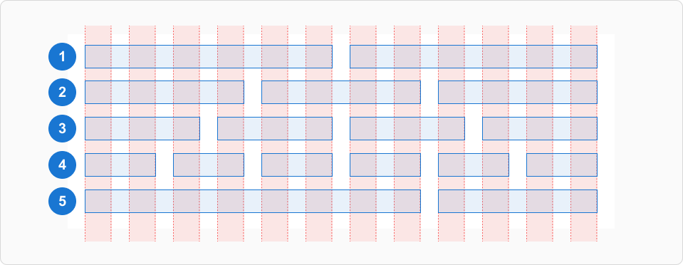
The above is an example of how a designer may vary columns of content or containers across a 12-column grid layout within a page.
- Two pieces of content or containers, spaced equally across a layout.
- Three pieces of content or containers, spaced equally across a layout.
- Four pieces of content or containers, spaced equally across a layout.
- Six pieces of content or containers, spaced equally across a layout.
- Two pieces of content or containers of unequal width: one that spans three-fourths of the page, and the other spanning one fourth of the page.
Grid gutters
Gutters are the spaces between columns (shown below in red). Gutter widths are fixed within each breakpoint range.
Fluid and fixed grids
Fluid grids are built using percentages for widths. As a result, columns are relative to one another allowing it to scale up and down fluidly.
Fixed grids have a set width and resizing the browser or viewing it on different devices won't affect the way the website looks.
While both fluid and fixed grid options can work for responsive websites, in most cases it's recommended to use fluid grids.
Fluid grids
Fluid layouts are calculated to their relative size, and stretch as the screen (viewport) is resized. For example, if you set layout width to 100%, each column will only be calculated to its relative size, and will stretch as the browser is resized.
Fluid grid at 320px
Fluid grid at 768px
Fluid grid at 1024px
Fixed grids
Fixed grids use columns of a fixed size, with fluid margins to keep content unchanging within each breakpoint range. A fixed grid's layout can only change at an assigned breakpoint.
Fixed grids at 1280px display
Fixed grids at 1440px display
Fixed grids at 2560px display
Content or container spanning
Make sure the content or container spans all of the columns in the layout (whether it is 2, 6, or 12 columns), rather than using columns as margins or padding. Following this methodology will keep layouts uniform and prevent unreliable responsive behaviour.
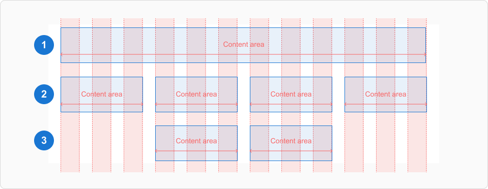
- Best practice for content or containers.
- Best practice for content or containers.
- Not recommended as this is relying on grid columns for margins, instead of the actual margins.
Spacing
Spacing is the negative area between elements in your layout as well as within components.
Our spacing system follows our grids system. Consistent spacing creates a visual balance that makes the user interface easier to scan. Apply consistent spacing to improve the quality of the user interfaces you produce.
To create an efficient layout, we consider 2 kinds of spacings: horizontal and vertical. Horizontal based mainly on the grid systems and spacings through elements. Vertical based on some rules and minimum spacings between components.
Mostly all components align to an 8px and 16px square baseline grid for mobile, tablet and desktop.
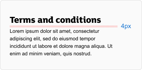
Typography, iconography, and some elements within components can align to a 4px grid.
Spacing values
Consistent spacing is mandatory and we strongly recommend only using these sizes:
| Value | Example of use |
|---|---|
| 4px | The margin between icon + text |
| 8px | The margin between label + input |
| 12px | The padding within components |
| 16px | The padding within components Most used spacing |
| 24px | The margin between sections/organisms |
| 32px | The margin between sections/organisms |
| 40px | The margin between sections/organisms |
| 48px | The margin between sections/organisms |
| 56px | The margin between sections/organisms |
| 64px | The margin between sections/organisms |
*Organisms are groups of molecules that work together to create a more complex component, such as a header or a footer. You create a more structured and scalable system by breaking down a design into its smallest components and then grouping them into molecules and organisms.
Visual example of vertical spacing values
Breakpoints
Breakpoints allow for the layout to change on different screen sizes for web responsive interfaces, so that the experience is always optimised for the device the user’s viewing it on.
Example of breakpoint re-sizing
Breakpoints allow for the layout to change on different screen sizes, so that the experience is always optimised for the device the user’s viewing it on.
For example, a product listing page might show 4 grid columns on a mobile device and 12 grid columns on a tablet and above. The design system has a core set of breakpoints that cover common device groups.
| Text | Breakpoints | No. of columns | Gutters |
|---|---|---|---|
| Mobile | 0px | 4 | 16px |
| Tablet | 600px | 12 | 16px |
| Small desktop | 900px | 12 | 16px |
| Medium Desktop | 1200px | 12 | 16px |
| Large Desktop | 1800px | 12 | 24px |
Click and touch targets
Components within the design system use a standard height of 48px. Larger components go up to 80px.
Clickable or touchable targets should be at least 48px by 48px.
For smaller components like icons, you can use invisible padding to reach the target size.
Padding and scale space
The design system uses the 8px base when adding horizontal and vertical space for layout objects, as well as internal padding within components.
In circumstances where elements would look cramped on larger screen sizes, spacing can adapt based on what breakpoint grouping the device falls in.
These values usually go up in multiples of 8px. But the spacing of elements can increase from 16px to 24px, depending on whether the user is on a phone or computer.
16px padding on mobile (below 720)
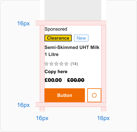
24px padding example at larger size
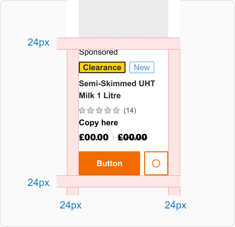
Padding at different breakpoints
| Spacing name | Breakpoints smaller than 720px | Breakpoints 720px or more |
|---|---|---|
| Default | 16px | 24px |
| SM | 16px | 16px |
| LG | 24px | 32px |
| XL | 1800px | 40px |
Aspect ratios
Aspect ratios describe the relationship between width and height. To keep things looking consistent, use consistent aspect ratios.
We recommend using 1:1, 2:3, 3:2, 3:4, 4:3, 9:16 and 16:9. These can apply to images, surfaces or components.
Design templates
Design templates can be found on the layout page of our Figma Libraries. They cover popular sizes for responsive web, iOS and Android.
Use them as a starting point when creating a new design or presenting work on a specific device.

Landmarks
Screen reader users may not be able to see the visual structure of a page. Landmarks are used to provide shortcuts that allow screen reader users to jump to key sections.
When a screen reader user navigates to a landmark, they'll be given a relevant description.
How to see landmarks on any page
We recommend you install the free Accessibility Insights Chrome extension. You can then turn on ‘landmarks’ within ‘ad hoc tools’.
How to use landmarks
You should make sure that the key landmarks, such as the header, navigation, main content and footer are present.
They can be added to a page by using a semantic element or by adding a role attribute. These include (Component / HTML element / role attribute):
<Header /> / <header /> / role="banner"<Navigation /> / <nav /> / role="navigation"<Main /> / <main /> / role="main"<Footer /> / <footer /> / role="contentinfo"
If there's more than one navigation landmark, use an aria-label to help the user to tell between them (for example, site navigation versus in-page navigation).
Get more guidance on landmarks from MDN Web Docs.