Toggletip
A toggletip is a type of tooltip that is opened when clicking or tapping on the trigger button.
How to use toggletips
Toggletips can provide short supporting text to help users understand something on a page. While tooltips can be opened on hover and focus, toggletips are opened with an explicit click or tap.
When using a toggletip:
- Only include supporting information that's not essential for the user to progress
- Allow the toggletip to be opened by a click, tap or the Enter or Space keys
- They uses edge detection and will adjust accordingly to the viewport
- They can be placed at any point within the parent content
- Only one toggletip can be open at a time
- Make sure the toggletip icon has an accessible name
Types of toggletip
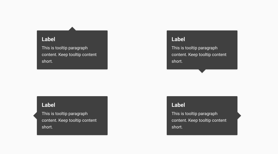
Toggletip positioning
Four positioning types are available for a toggletip.

If a toggletip's position is set in such a way that there is no room to open, it will change tooltip-position accordingly.
For example, if the toggletip is on the bottom of the page with a position of bottom, it will be set to top. This works vertically and horizontally.
Toggletip with label
If the content is short and concise you can use the label only content option.
Toggletip with paragraph content
Paragraph content is useful for longer descriptions. All the content in a toggletip should be brief (typically a maximum 1–2 sentences) and relate to the context where it was triggered.
Toggletip using paragraph content has a maximum width of 244px and a minimum width of 98px. Content that exceeds the maximum width wraps to a new line.
Use a modal instead of a toggletip if the content requires functionality beyond contextual content, such as a filter or other action.
Toggletip interaction
A toggletip is triggered by a clickable element, most commonly an icon button.
A toggletip can be closed by:
- Using the esc key
- Clicking or tapping outside of the toggletip
Content guidelines
If the information is essential to progress, don't hide it in a toggletip. Only use a toggletip for information that is additional and can't fit on the page in some other way.
When using a toggletip, keep the content as short as possible.