Toast
A toast is a type of notification that appears in a layer above other content on the screen. It contains a short, helpful and timely message communicating an update or feedback on a user action that disappears after a few seconds without disrupting the users experience.

When to use
Use a toast:
- For time-sensitive live notifications, such as a system message indicating the progress of an ongoing action.
- To display feedback that acknowledges an action, such as a success message confirming that an item was added to the trolley.
Don't use a toast:
- When providing users with a message related to a specific element on the page. We recommend using a 'Toggletip' or 'Alert' instead.
- When a user is required to make a choice, such as 'Confirm' or 'Cancel'. We recommend using a 'Modal' instead.
- When a page already has multiple overlaying items, for example a modal or drawer.
- To convey a long message, we recommend an 'Alert' instead.
- To share a message of high importance, we recommend an 'Alert' instead.
Anatomy

1.Icon (optional) 2.Message 3.Close Icon Button (optional), using our Button component 4.Action (optional)
Variants
System
System toasts are neutral and they can use any icon to further depict the message you are trying to convey. They are for communicating a message that doesn't fall into the other semantic categories, such as a status update from the system or an ongoing action taken by the user.
Success
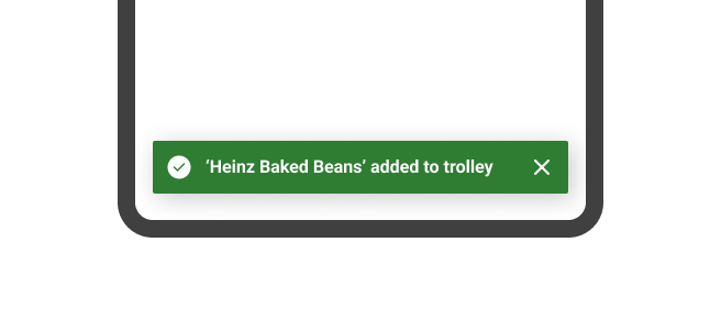
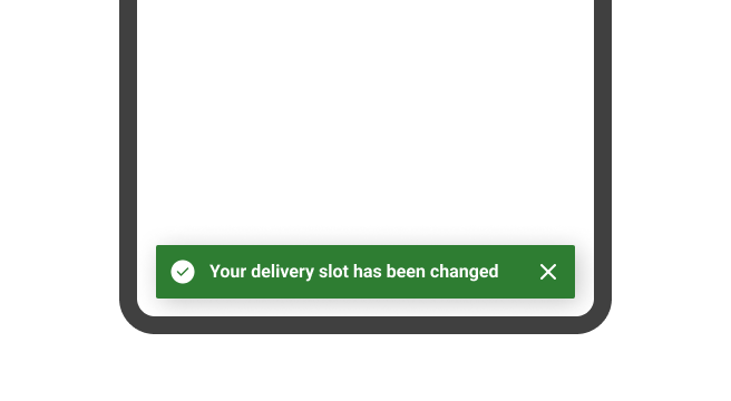
Success toasts are associated with the semantic green colour and use the tick icon. They are used for acknowledging that an action that a user has taken has been successful.

Error
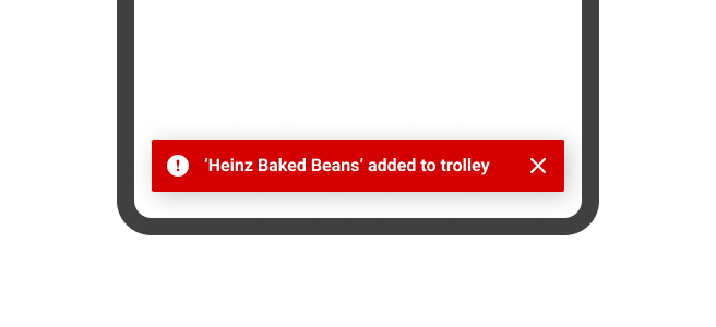
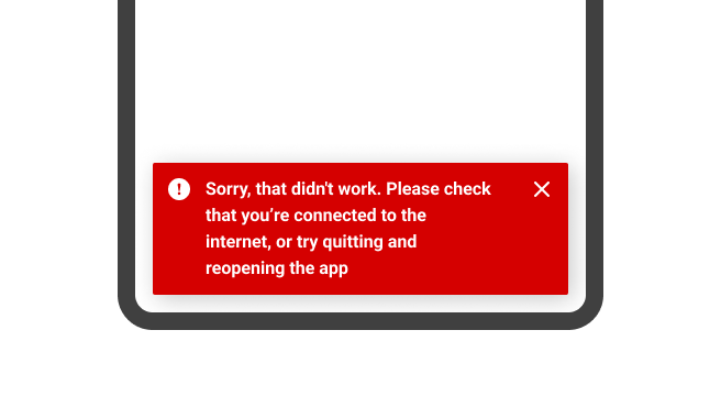
Error toasts are associated with the semantic red colour and use the error icon. They're used to communicate issues with the system or service to the user, and are typically used in situations where the user's not able to progress with their task.

Warning
Warning toasts are associated with the semantic yellow colour and use the warning icon. They're used to communicate issues with the system or service that are less serious than errors, allowing the user to still progress.

Info
Information toasts are associated with the semantic blue colour and use the information icon. They are used to communicate help or an update when a user trying to complete a task, but don't require any action in order to progress.

Behaviour of toast
Dismissible
Dismissible toasts include a close action so that users can choose to dismiss them before it automatically times out.

Toast with action
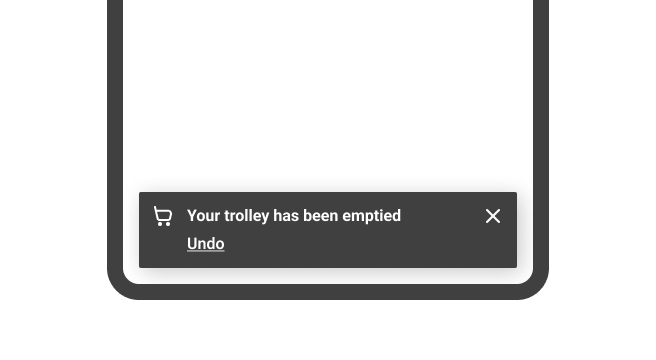
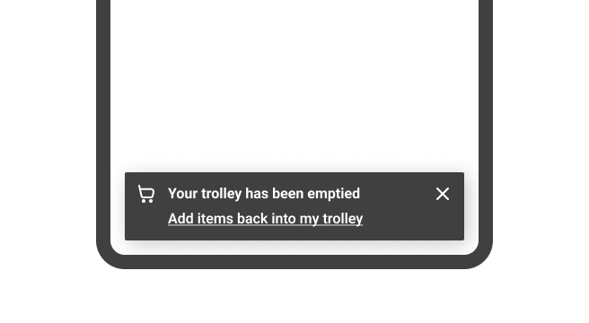
A toast can have one action, in addition to the dismiss action. This is often used to convey actions that can be undone, resolved or changed. It is positioned below the toast message to accommodate for responsive challenges and is in the form of a link.

Toast with icon
Toast can be presented with or without an icon. When using the semantic variants of the toast notification, their icon selection is fixed to it's semantic meaning. For example, success toast displays a 'check-circle' icon.

Wrapping
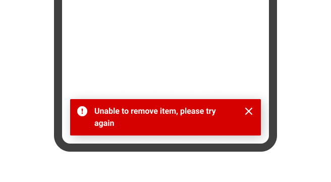
When the toast is too long for the horizontal viewport, it wraps to form another line.

Position
Toast can slide into view from a number of positions: top-left, top-centre, top-right, bottom-left, bottom-centre and bottom-right. All of which are offset by 16px from the nearest edge of the viewport. By default, bottom-centre is applied to the toast and so it's offset 16px from the bottom of the viewport.
Throughout a brand's product or service, we recommend keeping the position of the toast consistent. This is to avoid disrupting the user experience by providing a consistent point of reference for all kinds of toast notifications, making them more predictable.
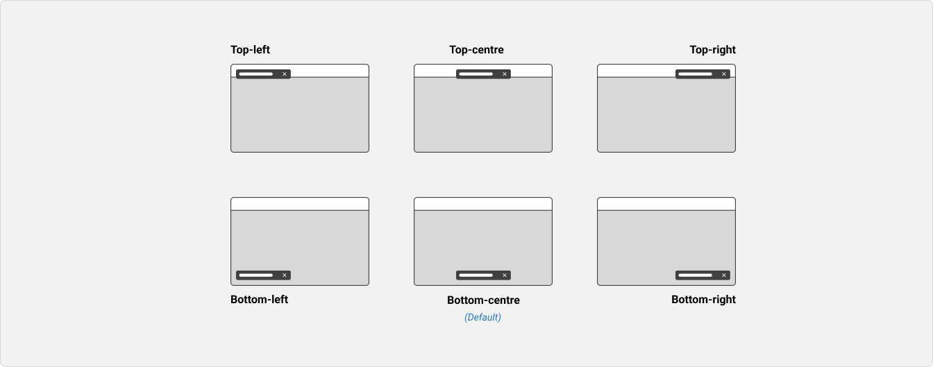
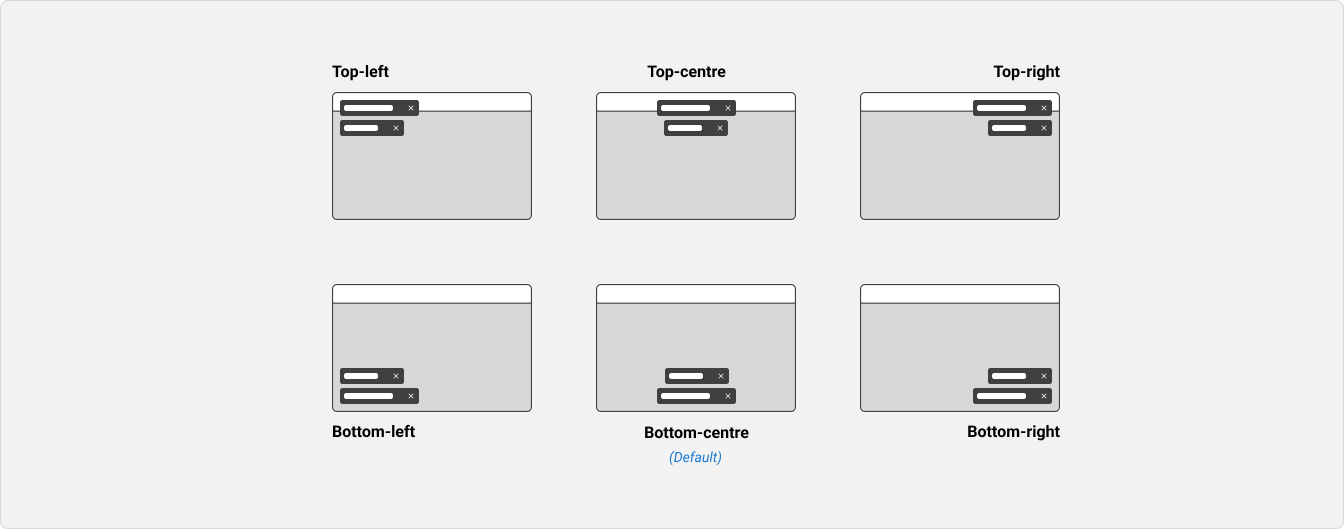
When multiple toasts are on display, they should appear stacked at the same position. They should also adopt the same horizontal alignment as their position (left, centre, or right).
Size
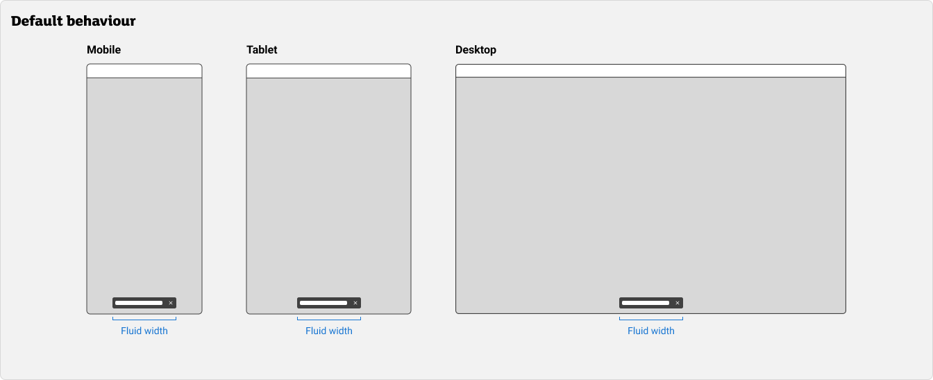
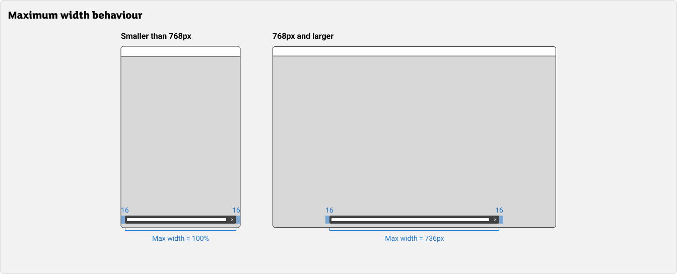
By default, the width of a toast is fluid when the message is short. However, depending on breakpoint the toast has a maximum width:
- On viewport sizes smaller than ‘md’ (768px), the maximum width of the toast is equal to 100% of the viewport width (inclusive of 16px left and right margins).
- On viewport sizes of 'md' (768px) and larger, the maximum width of the toast is 768px (inclusive of 16px left and right margins).
Stacking
When multiple toasts are triggered in close succession, they stack with 8px vertical spacing between them.
If the toast position is at the bottom:
- New toasts should appear from the bottom of the list.
- Older toasts will be pushed up until they time out or are dismissed.
If the toast position is at the top:
- New toasts should appear from the top of the list.
- Older toasts will be pushed down until they time out or are dismissed.
Stacking is an optional behaviour. If stacking is not required, each new toast will replace the previous one.
Duration
The duration of the toast depends on how it's configured:
By default, toast automatically disappears after 5,000 milliseconds (5 seconds). Duration can be tailored to your needs by updating the 'Duration' property. As a “safe” duration, we recommend 30 milliseconds for 1 word which takes into account the average reading speed of 200 words per minute (wpm). While hovering over a toast, the duration is paused (refer to the Accessibility section for more details).
Usage guidelines
Use semantic styles appropriately
Use the appropriate semantic style to communicate the tone of the message visually.
Don't override the position
Toasts are always fixed to the position property it has been set. By keeping the position of the toast consistent, it reduces the cognitive load for the user and becomes an expected home for all toast notification messages. This is further supported by WCAG's Guideline 3.2.4 Consistent Identification.
Content guidelines
Use a toast for contextual, timely messages
Toasts are appropriate for short updates or feedback related to a user action, and should not appear unexpectedly. It should contain information about a current action.
Keep messages short and concise
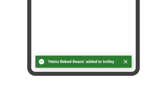
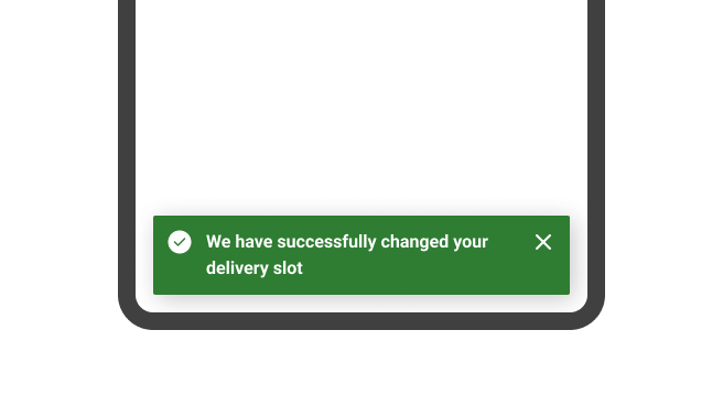
A single-line message is quicker to read and interpret at a glance. Users should be able to read the message in 5 seconds, so it should get straight to the point. We recommend not ending the line with a period or full stop.
For common actions such as create, add, update or delete, we recommend starting with the name or noun, followed by the action verb in past tense. Avoid including words that are already implied by the semantic style of the toast.
Keep action labels short
Favour a one-word label for the action, and the label should not exceed three words. The length of the action label should not exceed 25 characters
Accessibility
Aria
The toast should be assigned the ARIA role=“alert” to trigger screen readers to announce the toast message when it is on display, without the need for the toast to receive focus.
Since the toast would be read by screen readers when it appears, it should not be assigned any other ARIA role or attribute so that it won’t be read twice.
References:
Focus Considerations
When keyboard focus is placed on buttons in a toast, any auto-dismiss behaviour should be paused in order to meet WCAG's Guideline 2.2 Enough Time. Also, if there are multiple stacked toasts on the screen, focusing on or hovering over one of the toasts should pause the timeout countdown for all toasts.
If the toast does not contain an action (excluding the dismiss action):
- Don't force the toast to receive focus by altering its focus order. Using the keyboard, the toast message should always show up in the same place in the focus order.
If the toast contains an action:
- First consider if the toast would work better as an 'Alert' or 'Modal' instead.
- The toast should automatically receive focus when it appears, so that keyboard users can easily tab to the action.
- Since the toast would immediately be read by screen readers when it appears, it should not have the ARIA role=“status” attribute so as to prevent the toast from being read twice.
Keyboard Navigation
Keyboard navigation is important for helping users who do not use a mouse or pointer device. All interactive elements like links, buttons and controls must be able to receive focus and be operable using standard keyboard controls.
Tab: Moves focus to next focusable element inside the toast. When focus is on the last focusable element in the toast, moves focus to the first focusable element in the toast.Shift+Tab: Moves focus to previous focusable element inside the toast. When focus is on the first focusable element in the toast, moves focus to the last focusable element in the toast.Spacebar+Enter: If focus is on the close button, it dismisses the toast. If the focus is on an action, it executes the button action.Escape: Closes the toast.