Menu
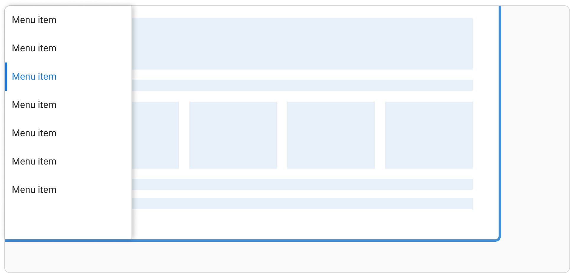
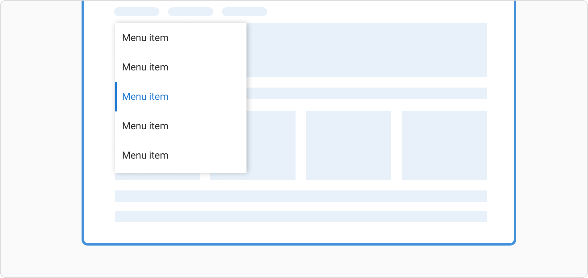
Menus allow users to navigate an experience through a list of actions or links.
How to use a menu
Menus display a list of actions or navigation lists to the user.
When using a menu:
- Use dividers to separate menu items into groups
- Use leading icons on menu items to help communicate meaning and help scannability
- They can have up to 3 layers of sub-menus which can be used to create categories
Menu positioning
Menus should appear in front of all other permanent UI elements.

Menus are positioned relative to the edge of the screen or browser. They typically appear below, next to (or in front of) the element that generates them. If they are in a position to be cut off by the browser or screen’s edge, the menu can instead appear to the left, right, or above the element that generates it.

Types of menu
Single level menu
A single level menu shows a list of menu items. They are actions, with no subcategorisation.
Two level menu
A two level menu shows a list of menu items and sub-menus. This should be used to create categorisation or group similar items. The open sub menu is shown in an active state. Only one sub menu can be open at a time.
Three level menu
A three level menu shows a list of menu items and sub-menus that go another level deeper. This should be used to create more indepth categorisation. The open sub menu is shown in an active state. Only one sub menu can be open at a time.
With dividers
Dividers are optional and can be used to separate list items into groups.
Content guidelines
When writing content for a menu:
- Labels in the menu should start with a capital letter and be in sentence case, unless they are a brand name
- Use an ampersand (&) in place of the word ‘and’ to reduce characters
- Keep labels short and concise