Drawer
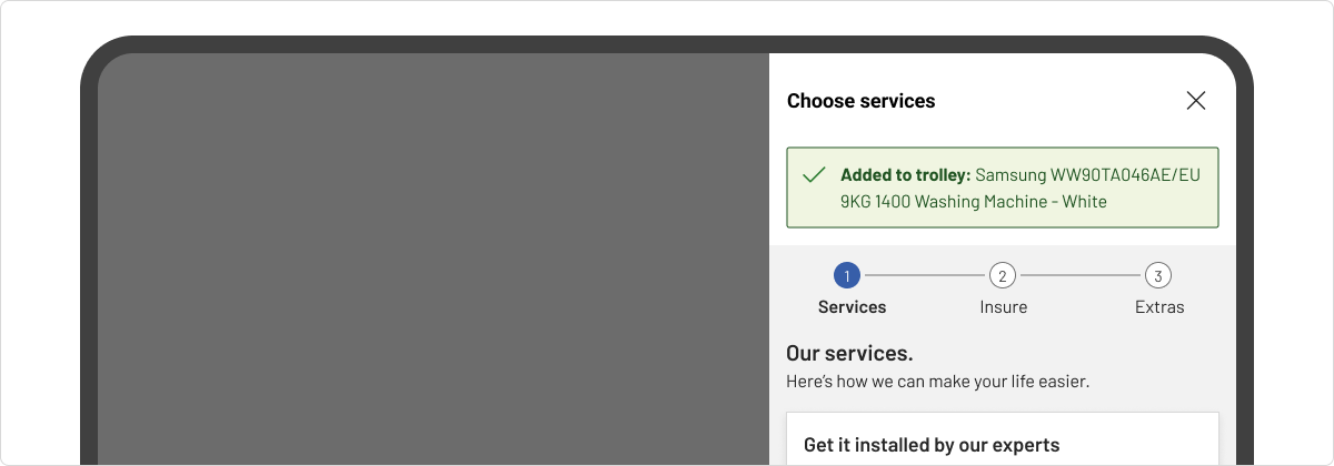
A drawer is a content panel that slides in from the side of the screen. It is typically used to display additional content that relates to the page behind it.

How to use drawers
Drawers are used to provide contextual information that is relevant to the page content underneath it. They are useful for cross referencing but only intended for a specific action. As drawers are disruptive to the user's experience, they should be used sparingly.
Use a drawer:
- Display additional or supplemental information to the user about an element or item.
- Make simple, contextual tasks available, for example adding or editing items within forms that would create scrolling or other usability issues if presented inline or in a modal.
Don’t use a drawer:
- If the additional content is part of a flow, consider loading a new page or grouping content into an accordion instead.
- If you want the user to focus on only the content in the drawer, we recommend you use a modal for this.
- When confirming an action, consider using a modal instead.
Anatomy of a drawer
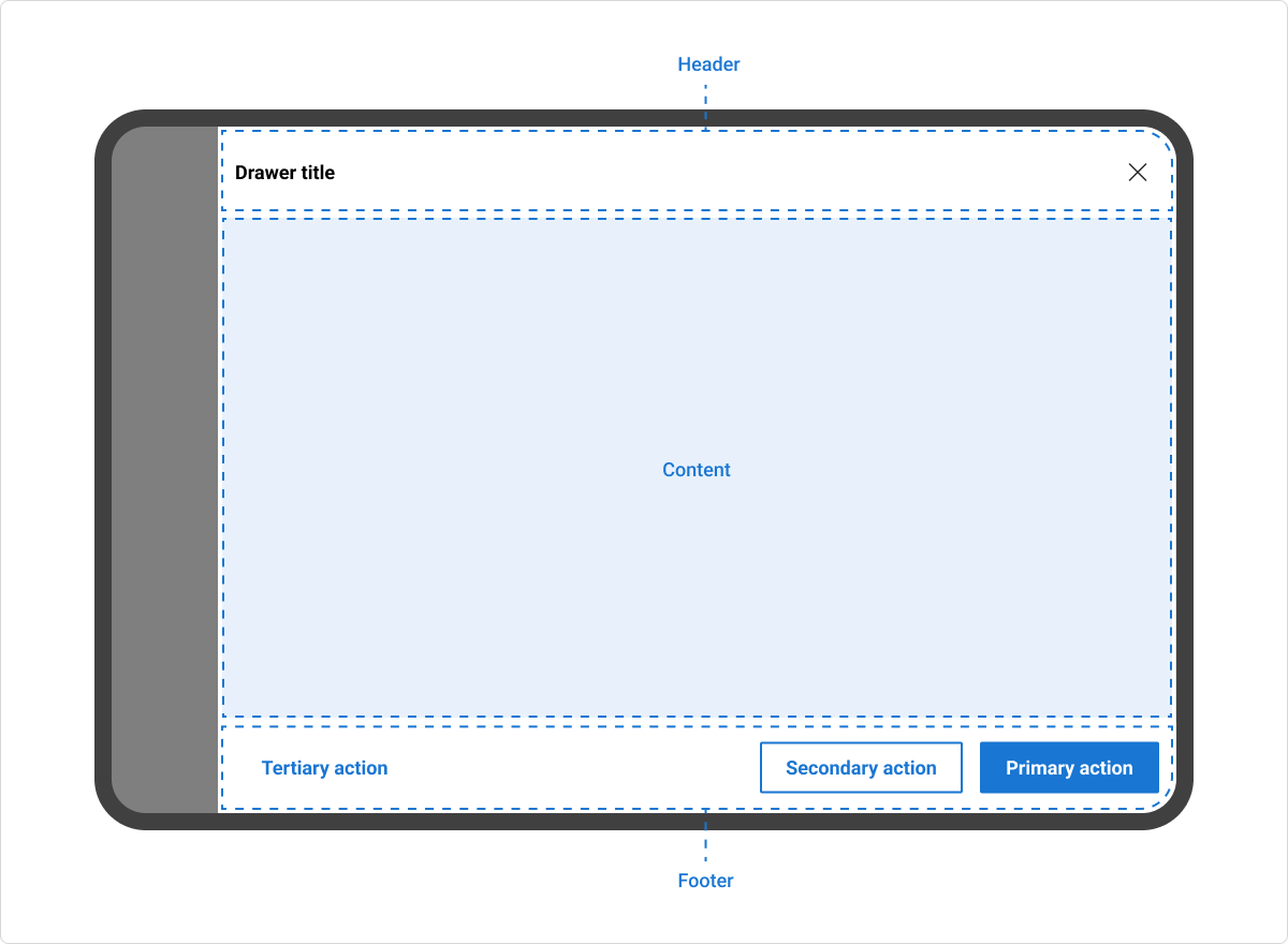
A drawer can include the following:
- Header: includes a title, supporting text, leading icon, and a dismiss icon button.
- Content: contains the content and/or controls needed to complete the drawer’s task. It can include text and/or components.
- Footer (optional): contains the primary actions needed to complete or cancel the drawer task. Blanket: a tinted transparent overlay that deprioritises the page content underneath the drawer.

Behaviour of a drawer
Size
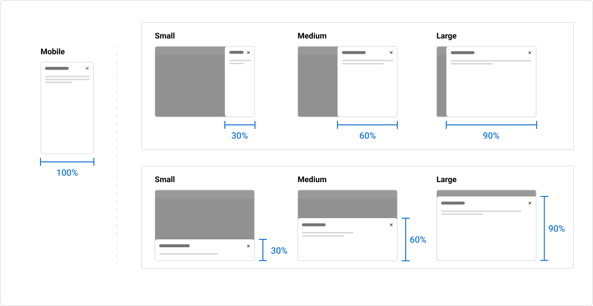
The drawer is available in four sizes: small (30%), medium (60%), large (90%), and full (100%). On smaller devices (< 576px/sm breakpoint), the drawer becomes fluid and occupies 100% of the viewport.

Position
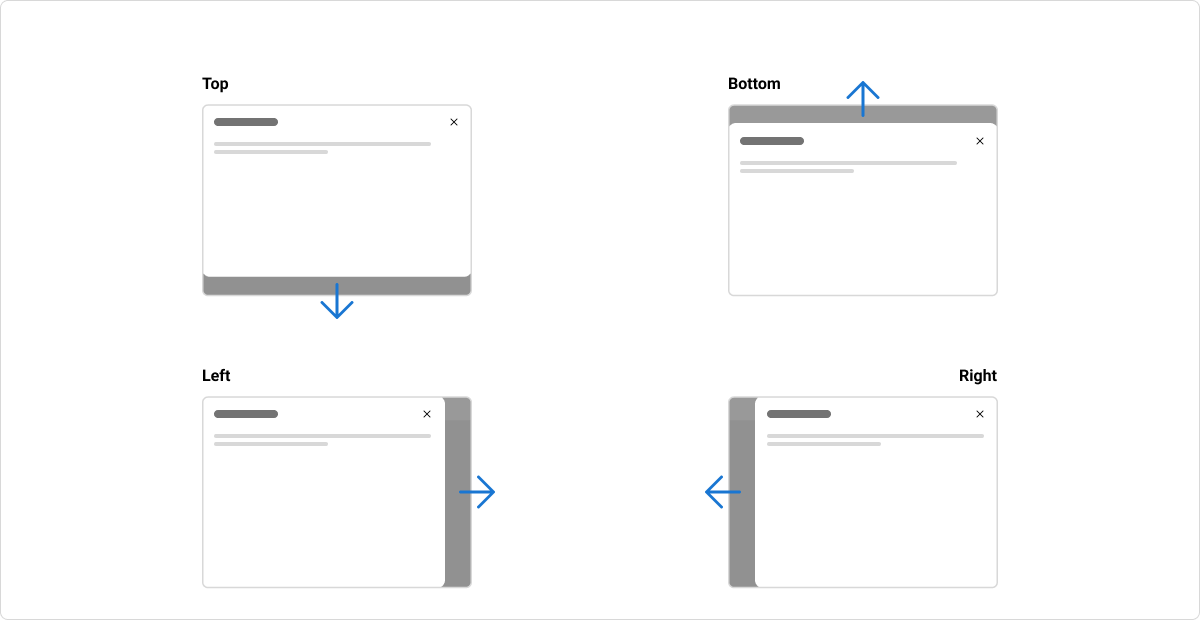
The drawer is able to slide into view from four different positions: top, left, bottom, and right.

Dismiss
The drawer is dismissible by using the ‘X’ icon in the drawer header (a child component). Alternatively, the user can click on the blanket to close the drawer. For keyboard users, they will press Escape to close the drawer.
Usage guidelines
Avoid overlapping drawers
Drawers are designed to be interruptive, ensuring that the users focus is only on the content within the drawer. Therefore, it's important that only one is used at a time and they are not stacked or nested.
Content guidelines
Headings
All drawers must have a descriptive heading that describes the content within the drawer.
Actions
Actions are optional within a drawer, but when they’re used they should be easy to understand what will happen if the button is used.
Accessibility
Aria
Use the aria-label or aria-labelledby prop to add an accessible name to the drawer. This will tell assistive technologies the name of the element given by this label helping users to understand what the element is for and how they can interact with it.
Focus Considerations
When a drawer opens, the drawer container receives focus. The objective of this is “focus trapping”, which allows the user to tab through drawer content without the risk of falling out of it’s tab index.
Keyboard Navigation
Keyboard navigation is important for helping users who do not use a mouse or pointer device. All interactive elements like links, buttons and controls must be able to receive focus and be operable using standard keyboard controls.
Tab: Moves focus to next focusable element inside the drawer. When focus is on the last focusable element in the drawer, moves focus to the first focusable element in the drawer.Shift+Tab: Moves focus to previous focusable element inside the drawer. When focus is on the first focusable element in the drawer, moves focus to the last focusable element in the drawer.Escape: Closes the drawer.