Content card
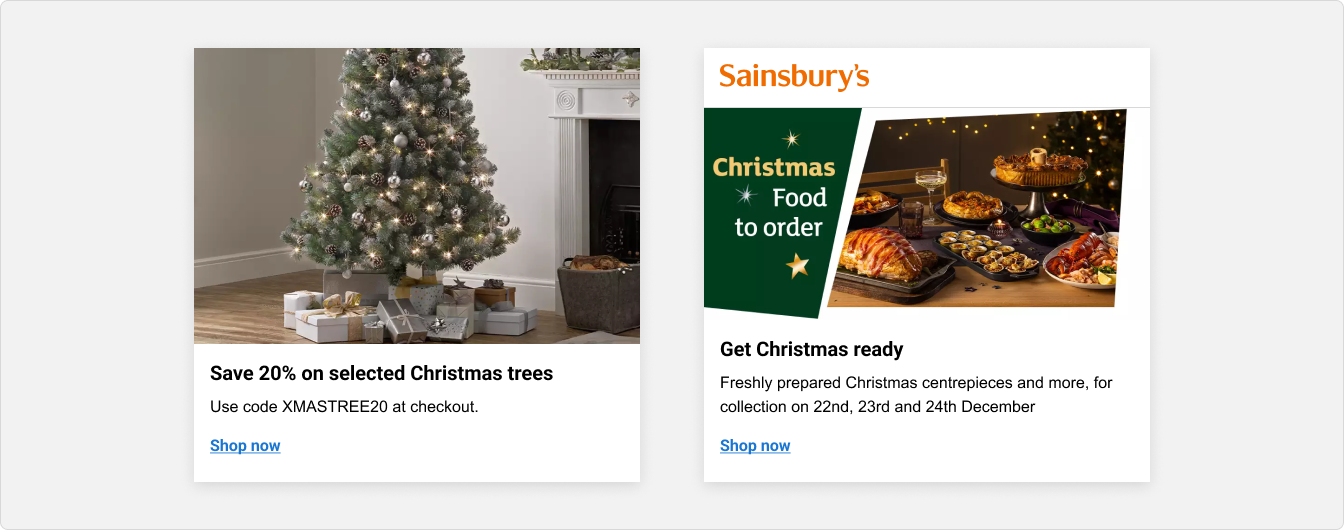
A Content card is used to display general information such as news, promotions, articles, or other brand-related content. It is an ideal way to display campaigns, or other content that leads to an informative page rather than a product purchase.

When to use
Use a content card:
- To display related content, such as announcing a seasonal campaign or promotion.
- To highlight your brand offers, such as delivery passes or the Nectar loyalty scheme.
- To provide informational articles about your brand.
Don't use a card:
- For displaying products, we recommend using a 'Product Card' instead.
- For displaying large amounts of content because cards can get quite cluttered and overwhelming to users.
- For single pieces of content, a card might add necessary visual complexity.
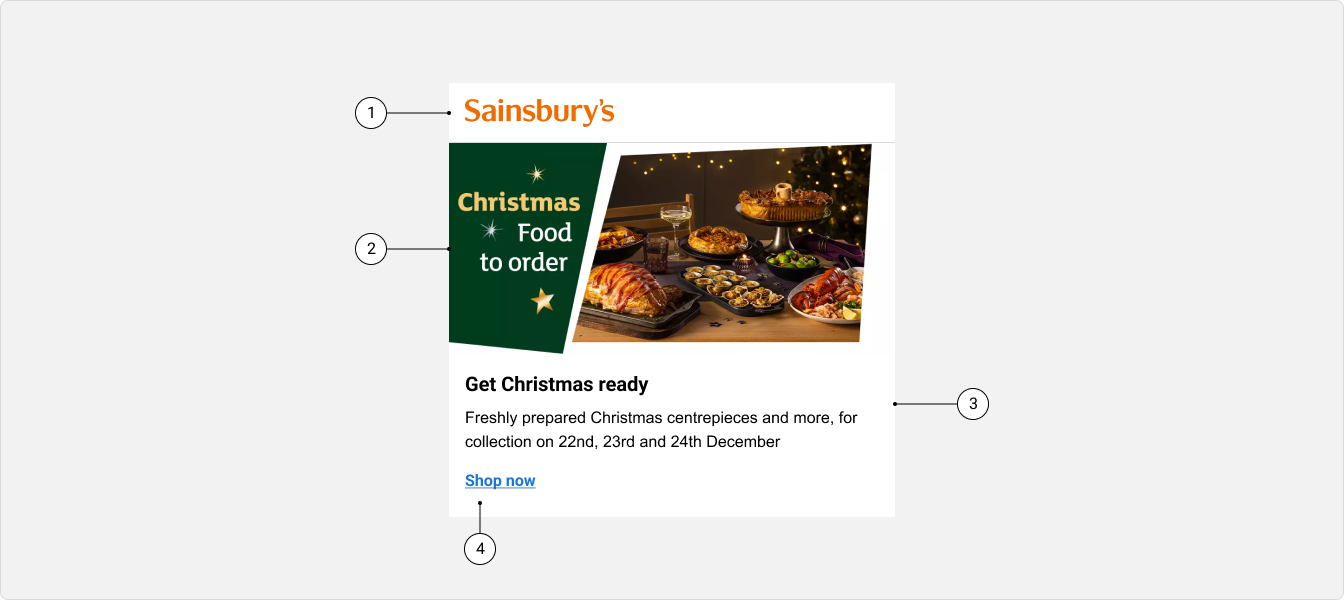
Anatomy

(1) Header (optional)
(2) Image (optional)
(3) Content (optional)
(4) Footer (optional)
Components
Header
An optional header sits at the top of the vertical content card, it has a number of variants to help introduce the content within the card with a clear title or logo.
Image
Most cards include image to show a previous of a product or service. This should appear at the top of the card, below the heading if that is being used. However, there are some scenarios where it must be placed in the centre or bottom.
Content
A content area can hold many different components, but always a label which acts as a title or subtitle for the card.
Footer
An optional footer sits at the bottom of the content card. The footer has a content area that can hold up to three buttons or links.
Specs
Outlined
Content cards can either be built with or without an outline. It's recommended that a border should be used when the card is padded, and to apply the border it's 1px in width and uses monochrome-light.
Orientation
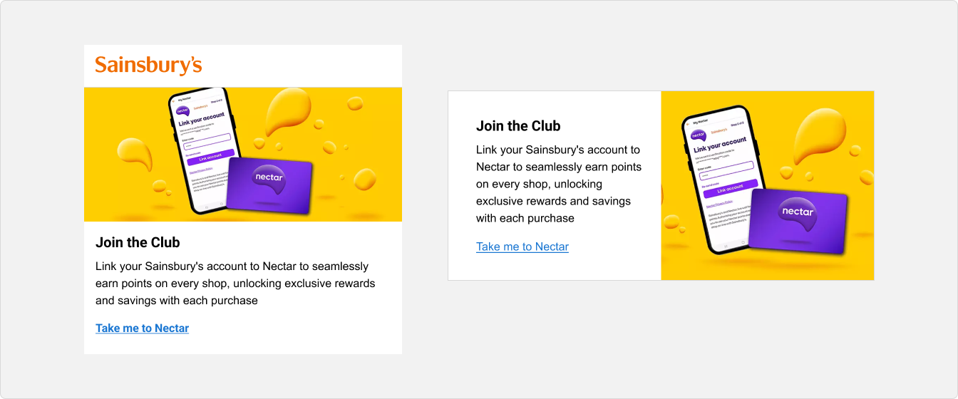
Content cards can be laid out vertically where the content is stacked or horizontally when the content is inline.

Image position
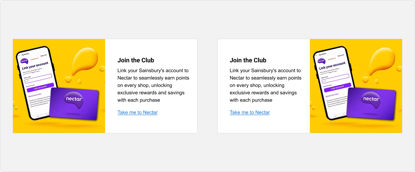
When the content card's orientation is horizontal, the image can either be positioned on the left or the right.

Usage guidelines
Keep cards simple
Cards are meant to just show a taste of the available information. Don’t overload cards with more information than necessary.