Banner Carousel
A banner carousel displays several slides in a linear sequence, with a single slide in view.

Banner carousels can accommodate various types of content including text, images and videos. It includes visual navigation such as buttons, arrow controls and pagination to indicate that it is interactive.
Users can control which slide is visible by using the arrow controls or pagination to navigate the banner carousel, or by swiping through it on touchscreen devices.
When to use
Use a banner carousel:
- To display content such as banners or illustrations designed to attract attention, serve as a key entry point or create moments of delight.
- To introduce new product features or updates to users, e.g. as part of an onboarding flow.
Don't use a banner carousel:
- If you're looking to display a sequence of similar items for browsing or comparison, e.g. product cards, we'd recommend using a 'Carousel' instead.
- Refrain from displaying too many slides, i.e. more than 10 slides, in a banner carousel.
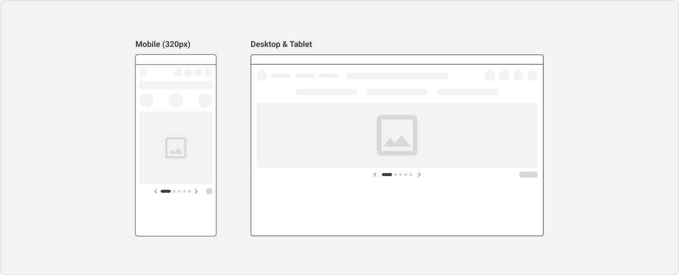
Anatomy
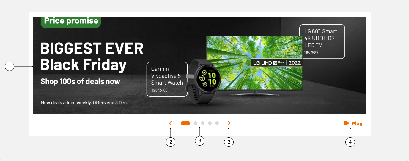
A banner carousel can include the following:
- (1) Slide: this can include various types of content such as text, images and videos.
- (2) Controls: buttons that allow the user to navigate to the previous or next slide.
- (3) Pagination: a row of indicator buttons that denotes the current slide and allows the user to jump between slides.
- (4) Play/Pause button (if autoplay is enabled): a button that allows the user to play or pause the scrolling movement of the banner carousel.
Specs
Width
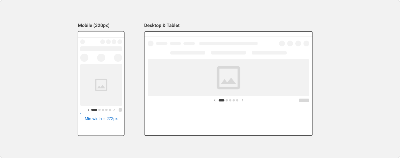
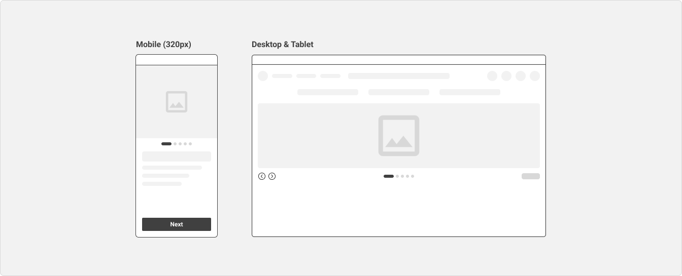
The banner carousel has a minimum width of 272px to support the smallest screen width of 320px.
On mobile devices, the banner carousel should usually take up 100% of the viewport width, inclusive of any left and right margins set at the page level.
Height
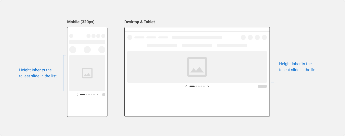
The height of all slides in the banner carousel should inherit the height of the tallest slide. The height of the carousel container should not change while the user is navigating the banner carousel.
When using images as the main slides in the banner carousel, all of them should have the same height.
Pagination & controls
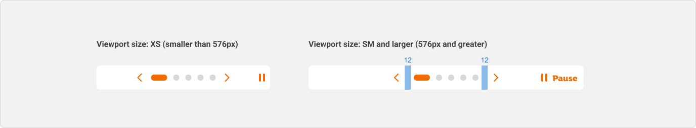
Within the pagination, there is no spacing between the pagination dots.
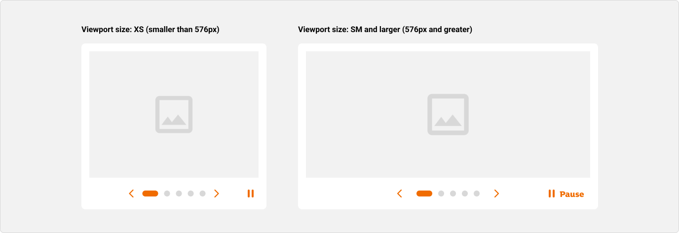
On viewport sizes smaller than SM (576px), there is no spacing between the arrow controls and pagination dots.
On viewport sizes of SM (576px) and larger, the arrow controls and pagination dots are separated by 12px spacing on both sides.
Variants
Default controls
If the default arrow controls are enabled, they will appear at the left and right sides of the pagination and the banner carousel cannot be externally controlled using any custom buttons.
Custom controls
If support for custom controls is enabled, the default controls will be disabled and hidden from view. Instead, the banner carousel can be controlled using custom buttons that can be styled and positioned differently from the default controls.
Refer to the usage guidelines for guidance on how the external controls should be designed and labelled.
Behaviour
Pagination
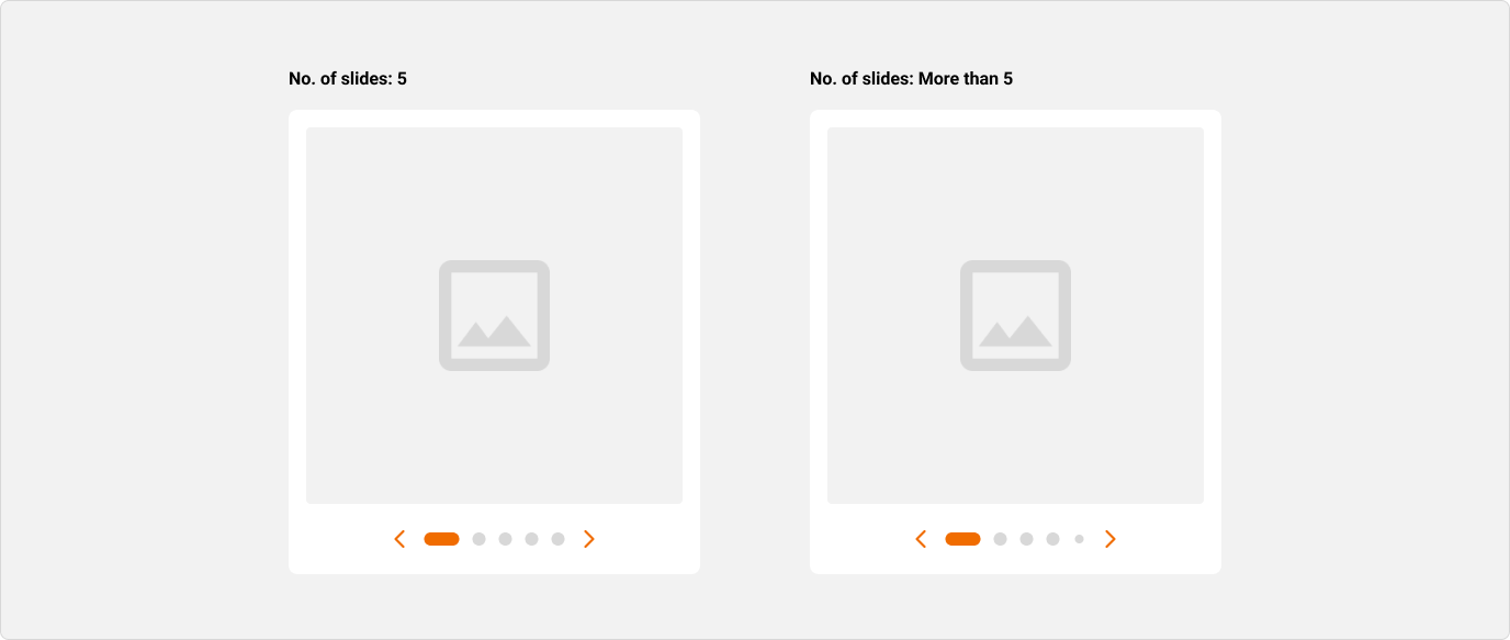
The pagination appears as a row of dots, each representing a slide in the banner carousel. The current slide is denoted by a solid horizontal line.
Across all viewport sizes, there should be a maximum of 5 visible pagination dots.
If there are more than 5 slides in the banner carousel:
- The pagination will be clipped as there are too many dots to fit into the available space.
- The pagination dots at the edges will be slightly reduced in size to indicate that there are more slides than the number of visible pagination dots.
Autoplay
A banner carousel can be made to autoplay its scrolling movement. If autoplay is enabled, it will be turned on by default.
Play/Pause button
Users who find the movement too fast or distracting can pause autoplay using a Play/Pause button, in accordance with WCAG 2.1 Guideline 2.2 – Enough Time.
If autoplay is enabled, the banner carousel will contain a Play/Pause button that allows users to start and stop autoplay. The button will be visible to all users, whether they are interacting with a mouse, keyboard, screen reader, or touch.
On mobile devices, the label of the button is hidden. On tablet devices and larger, the label is displayed.
If autoplay is disabled, the Play/Pause button will not be displayed.
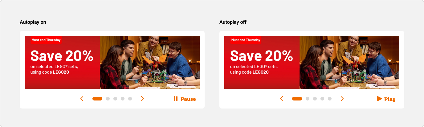
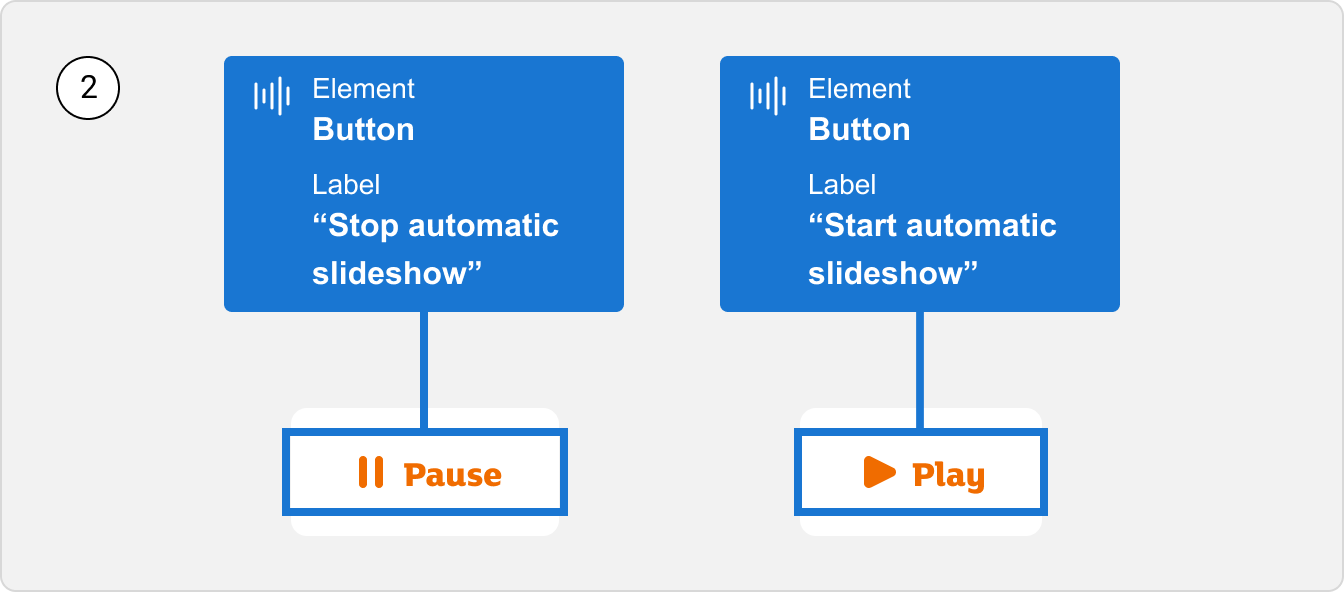
In autoplay mode, the button will have a ‘Pause’ label. Clicking on it will pause autoplay.
When autoplay is paused, the button will have a ‘Play’ label. Clicking on it will resume autoplay.
Duration
In autoplay mode, the default duration between content transitions is 5000ms (5 seconds).
Duration can be tailored to your needs by updating the ‘Duration’ property. As a ‘safe’ duration, we recommend 30 milliseconds for 1 word which takes into account the average reading speed of 200 words per minute (wpm).
References:
Scroll direction
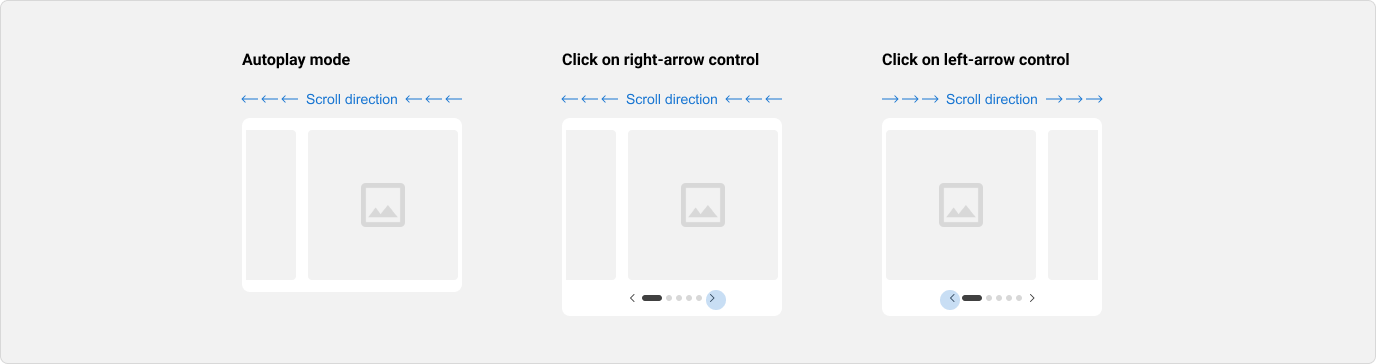
- In autoplay mode, the next slide will scroll into view from the right.
- Clicking on the right-arrow control or a subsequent pagination dot will make the next slide scroll into view from the right.
- Clicking on the left-arrow control or a preceding pagination dot will make the previous slide scroll into view from the left.
Usage guidelines
Don't enable autoplay if the banner carousel contains video or animated elements
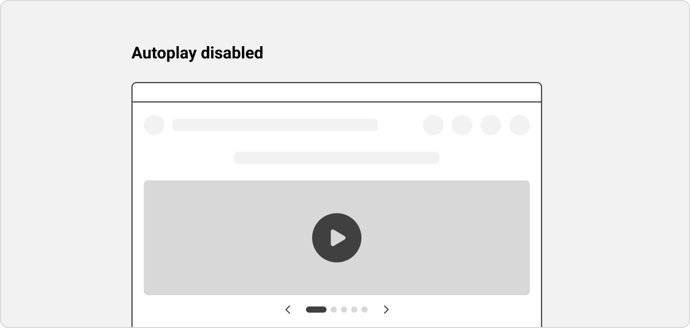
Autoplay should be disabled in banner carousels that contain videos or animated elements.
Enabling autoplay in this case could adversely affect users with cognitive conditions such as attention deficit disorder who are easily distracted by moving content. The additional movement from the videos or animated elements could prevent users from concentrating or interacting with the website.
References:
Use properly labelled buttons for custom controls and position them close to the banner carousel
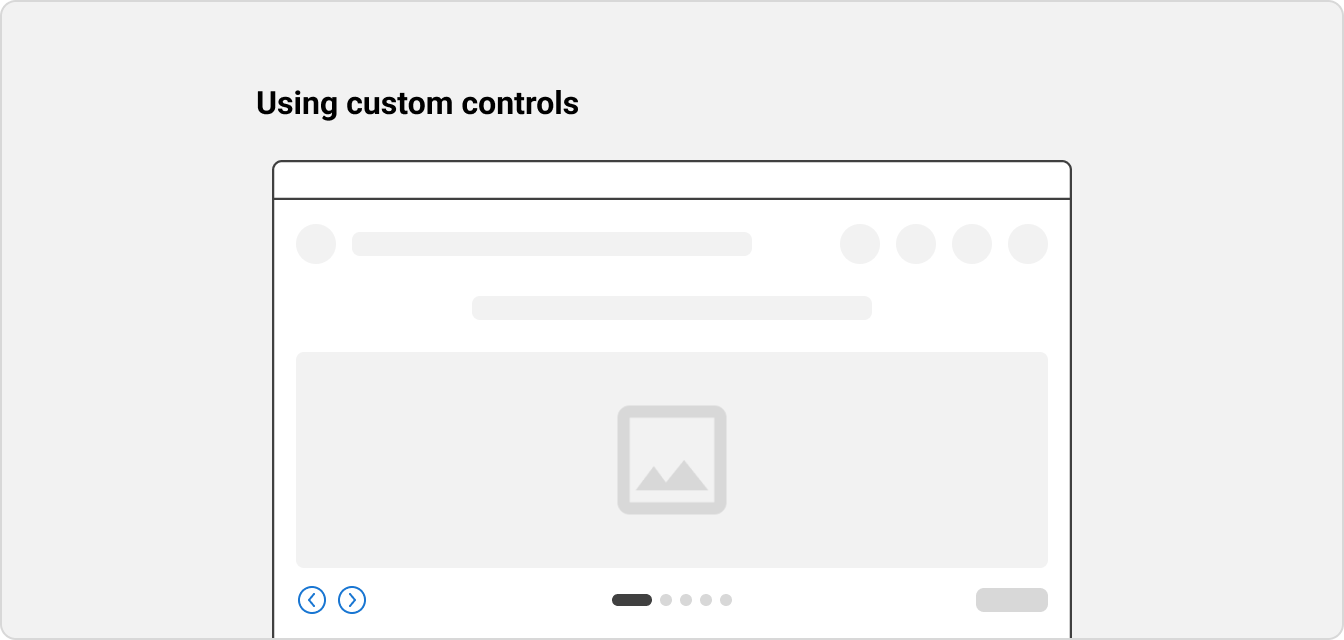
Custom controls should be semantic button elements that include clear, intuitive labels or icons.
For example, the custom controls can be labelled as “Previous” and “Next”, or use chevrons to indicate the previous and next slides. They should be labelled by clear accessible names for screen reader users, e.g. “Previous slide” and “Next slide”. Refer to the ‘Accessibility’ section for more information.
The custom controls should also be positioned close to the banner carousel container to indicate that they should be used to navigate the banner carousel.
Most important content always come first
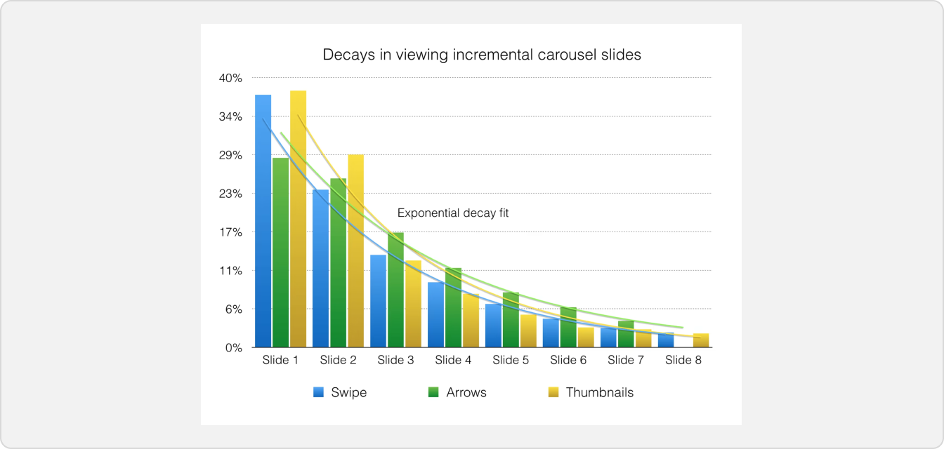
It is suggested that there is a decline in the number of interactions, the further a user advances through the banner carousel. Hence, it is important to place your most important slides first to avoid them being missed by users.
References:
Limit the height of the slides to 50% of the screen’s height (max)
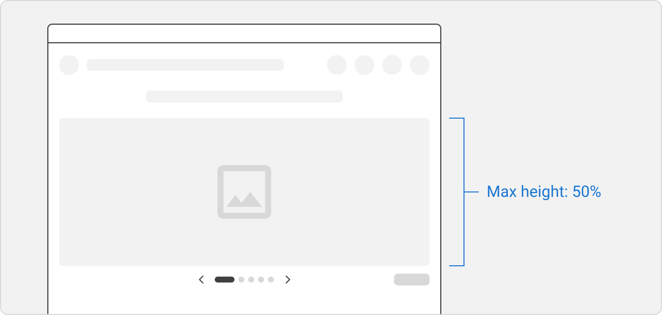
Research shows that on mobile, we tend to interact with pages by reading, swiping and scrolling in the centre of the screen. With this in mind, a carousel with a maximum height of 50% allows users to position the component in their preferred position of the screen to then interact with it.
References:
Accessibility
Autoplay
People require different lengths of time to read content, and some people with cognitive conditions such as attention deficit disorder may find moving content distracting. While the banner carousel supports autoplay, it is important that users are able to easily stop or control the autoplaying movement.
Once a user has explicitly interacted with an autoplaying banner carousel, autoplay will be paused. This includes:
- Focusing on the slide or pagination
- Clicking on the slide, arrow controls or pagination dots
Autoplay only resumes if the user explicitly activates the Play/Pause button.
References:
Tab order & screen reader behaviour
The banner carousel is carefully constructed to ensure that it is screen reader-friendly. Semantic button elements with clear accessible names are used for all interactive controls in the banner carousel.
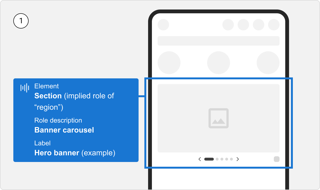
(1) The banner carousel container is the first element that receives focus when the keyboard or screen reader user accesses the banner carousel.
A <section> tag (with implicit role="region") with the aria-roledescription=“Banner carousel” attribute is used for the container, so screen reader users know exactly where it starts and ends in the DOM.
Each banner carousel should also be assigned an aria-label attribute. This helps to distinguish between multiple banner carousels on a page.
(2) Next, the keyboard or screen reader user accesses the Play/Pause button. This enables people who find moving content distracting to easily stop autoplay.
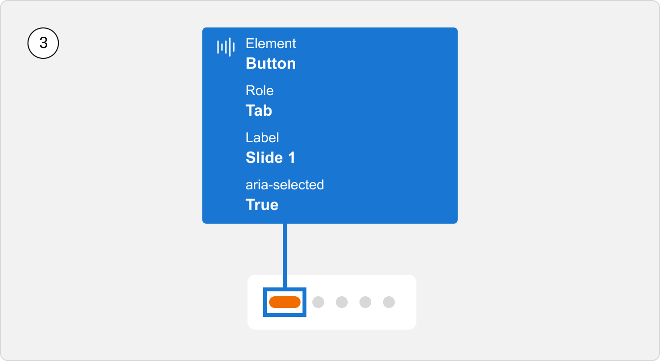
(3) Next, the keyboard or screen reader user accesses the pagination.
When the pagination receives focus, so does the active pagination dot. Arrow keys are used to navigate between the pagination dots, not the Tab key. This enables users to quickly tab from the pagination to the slide.
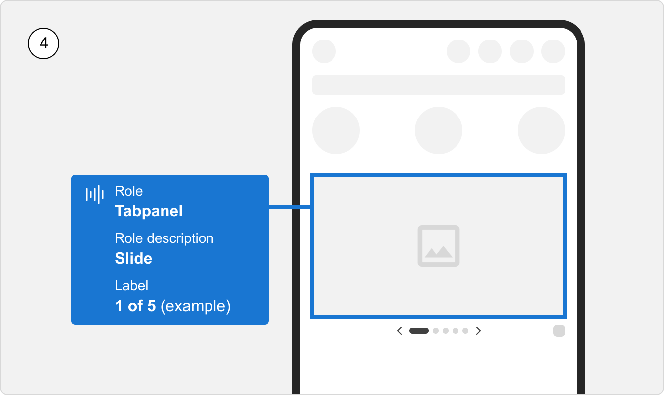
(4) Lastly, the keyboard or screen reader user accesses the slide.
If the slide itself is interactive, it will be announced as a link along with its role (e.g. image) and aria-label (accessible name).
If the slide contains any other interactive elements, the user will tab through them before exiting the banner carousel container.
References:
Keyboard interactions
Keyboard navigation is important for helping users who do not use a mouse or pointer device. All interactive elements like links, buttons and controls must be able to receive focus and be operable using standard keyboard controls.
Since keyboard users can use arrow keys to navigate the banner carousel, we have excluded the “previous” and “next” controls from the tab order, so that they don’t receive keyboard focus unnecessarily.
Tab: Moves focus to the first element in the banner carousel, and to subsequent elements following the tab order.←or→: When the pagination is in focus, they are used to navigate to the previous or next slide.SpacebarorEnter: Activates the interactive element in focus.